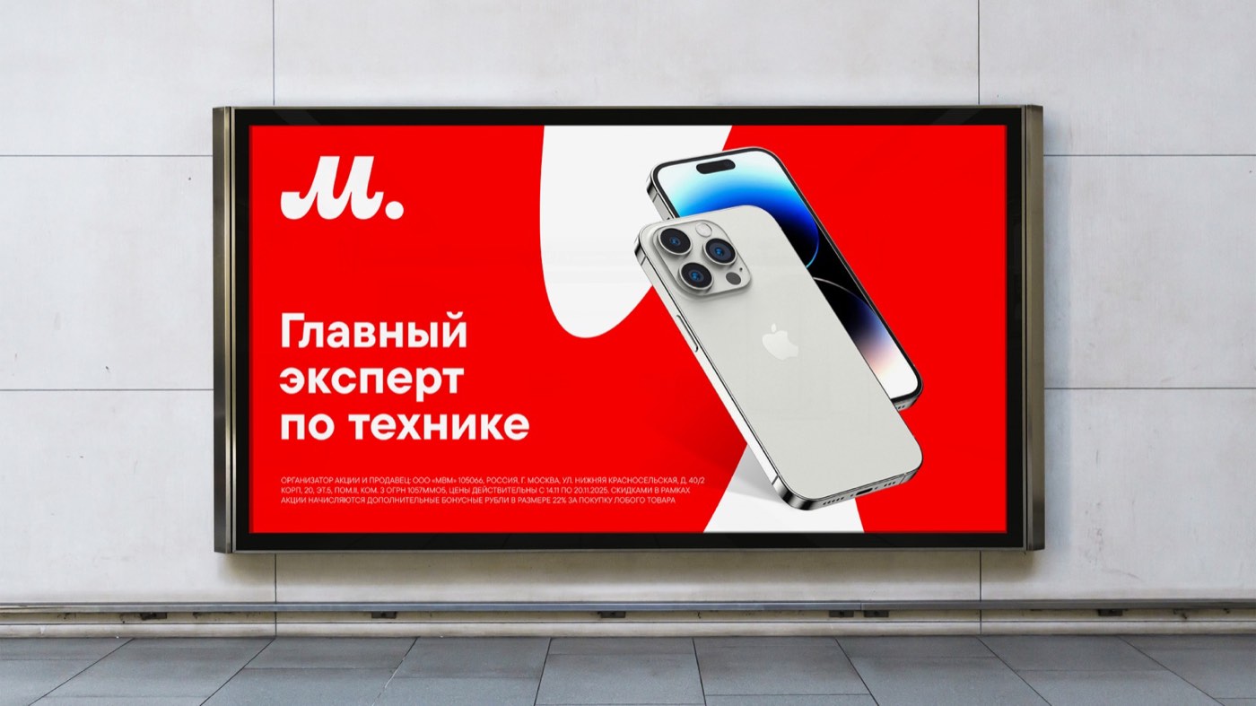
The Ultimate
Tech Expert
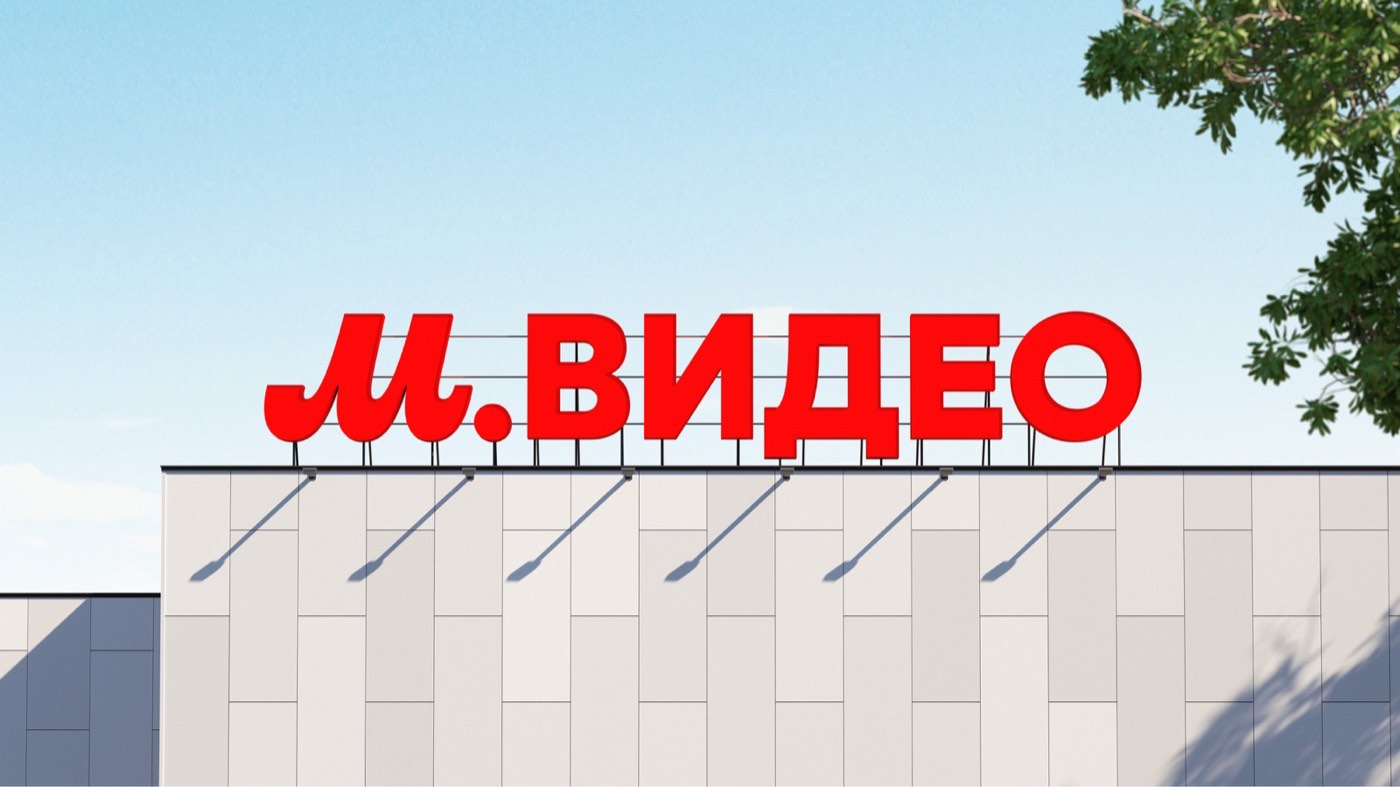
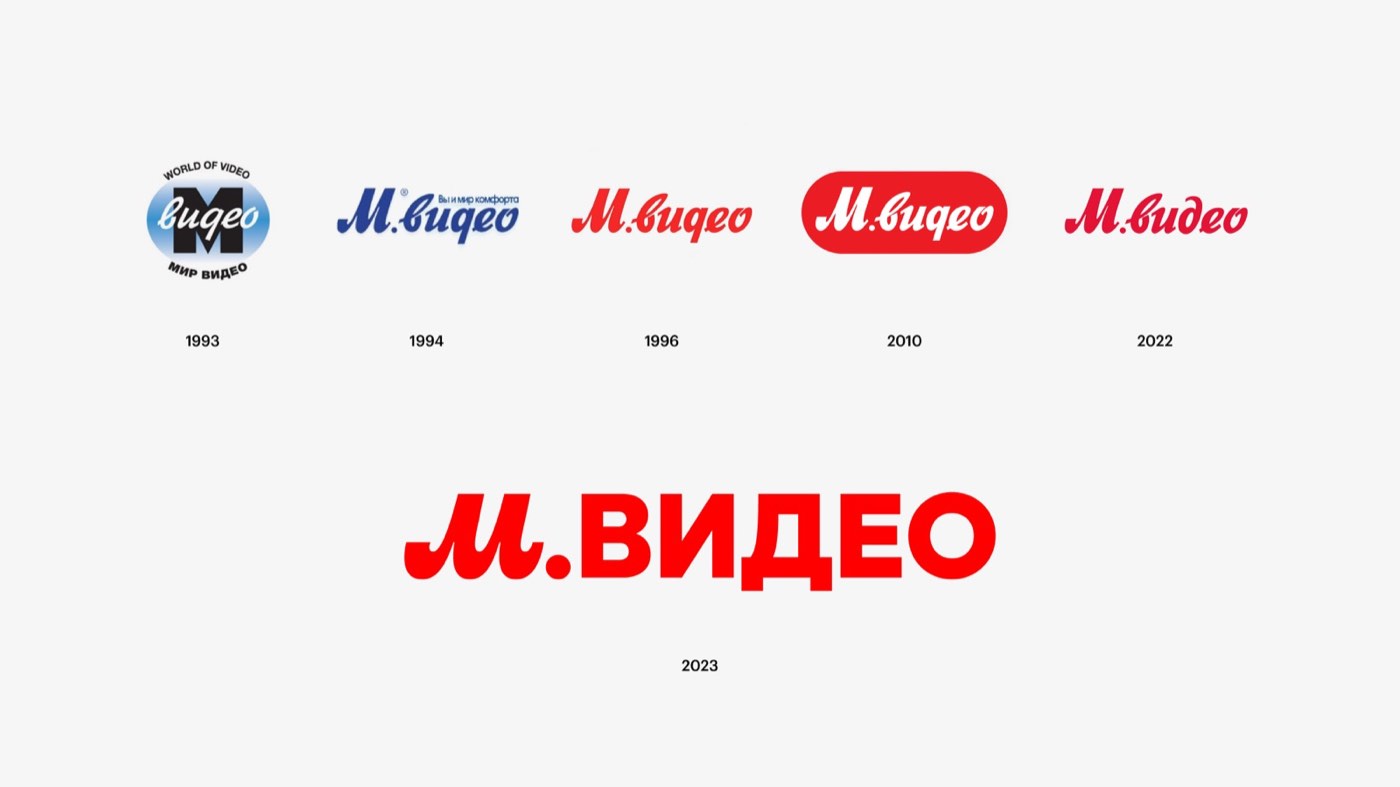
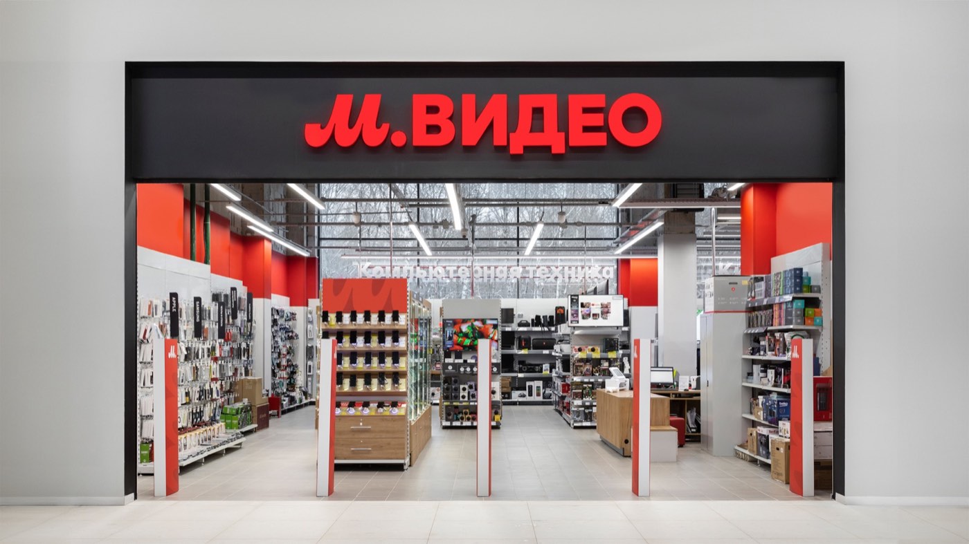
M.Video's logo hadn't changed since 1994. In the year of the company's 30th anniversary, we initiated and led the first rebrand in three decades — new positioning, a new visual language, and the letter M transformed into the brand's defining element.
From electronics retailer — to the ultimate expert
The old "Online / Fast / Nearby" model described logistics, but gave the brand no character. The new positioning "The Ultimate Tech Expert" is a role, not a delivery promise. The company takes responsibility for your choice — advises, explains, and guarantees results. The shift to the OneRetail omnichannel service model demanded a new communication language as well.
Recognition preserved — everything else updated
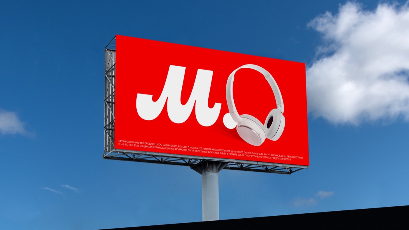
Millions know the M.Video logo. The task wasn't to destroy that — it was to leverage it. The Heritage concept: take what works — red, white, the distinctive letter — and make it bolder, more contemporary, more digital. The letter "M" grew, becoming an independent design element and the foundation for patterns.
We offer. We deliver. We guarantee.
The new messaging system was built around action-oriented language that puts the brand's promise front and center: what M.Video does for you. Communication became concrete — not about the brand, but about the action. Three verbs, three commitments.